Introduction: Color Psychology in Branding
Have you ever noticed how certain brands instantly evoke emotions or memories just by their colors? Think of Coca-Cola’s vibrant red or Starbucks’ calming green. These reactions are not random; they are a result of color psychology, a powerful tool that influences how people perceive and interact with brands.
Color is far more than a visual element; it’s a powerful psychological tool that can shape emotions, influence decisions, and affect perceptions of brands. Color psychology, the study of how colors impact human behavior and perception, plays a crucial role in marketing and branding. Brands don’t just pick colors randomly; each shade communicates values, emotions, and identity. Understanding how color affects brand perception can help businesses create stronger connections with their audience, increase recognition, and influence purchasing behavior.
In today’s competitive market, color matters more than ever. It can make your brand feel trustworthy, exciting, luxurious, or even playful. Combined with other branding elements like typography and messaging, the colors a brand chooses play a critical role in shaping brand perception, the way consumers interpret and emotionally respond to a brand.
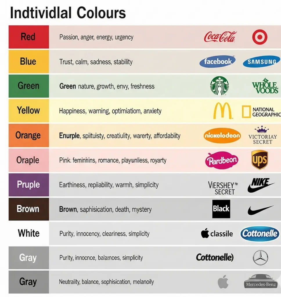
This article will explore the fascinating relationship between color psychology and brand perception, providing insights, examples, and practical tips for brands aiming to make a lasting impression.
What Is Color Psychology?
Color psychology is the study of how colors affect human behavior, emotions, and decision-making. It examines the subtle ways in which color can influence perception, mood, and even physical responses.
In marketing, color psychology is used strategically to:
- Capture attention
- Elicit emotions
- Communicate brand values
- Influence consumer behavior
When applied effectively, color can elevate a brand from ordinary to iconic.
Why Color Matters in Marketing and Branding
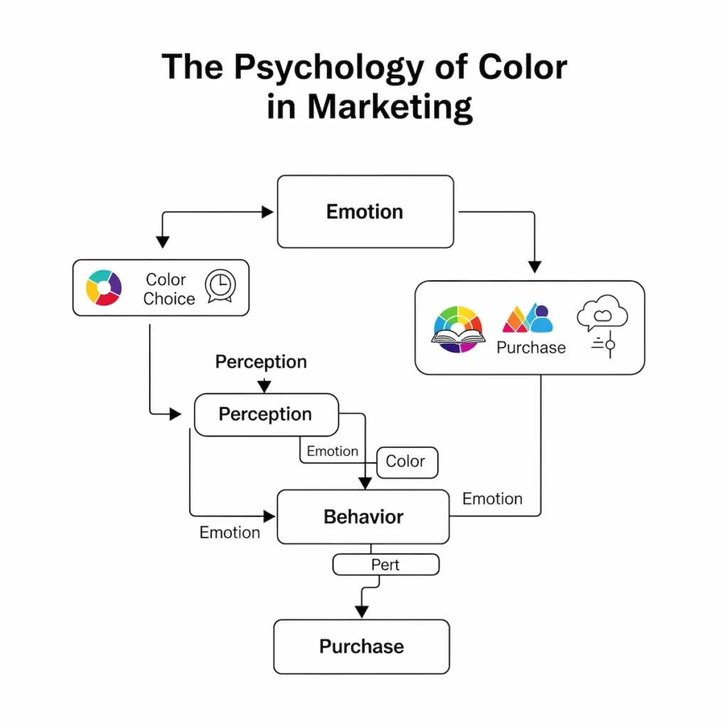
The human brain processes visuals 60,000 times faster than text, making color a critical component of first impressions. Research suggests that up to 90% of snap judgments about products can be based on color alone. This is why marketers and designers spend significant time selecting the right hues for brand logos, websites, packaging, and advertising.
Key reasons color matters include:
- Immediate recognition: A strong color palette helps consumers identify your brand instantly.
- Emotional connection: Colors evoke specific feelings that align with your brand personality.
- Behavioral influence: Certain colors can motivate action, such as making a purchase or signing up for a service.
By understanding how color influences perception, brands can craft strategies that resonate deeply with their audience.
The Role of Color in Brand Perception
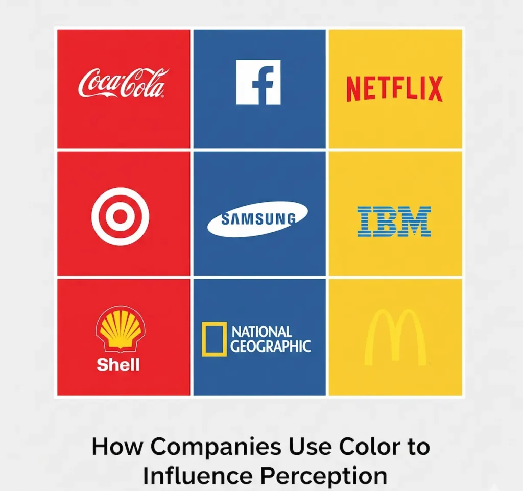
How Colors Influence Emotions and Behaviors
Colors communicate messages beyond words. For instance:
- Red conveys urgency, excitement, and energy.
- Blue signals trust, reliability, and calm.
- Green suggests growth, health, and sustainability.
These emotional triggers are subconscious but powerful, shaping how consumers feel about a brand and whether they choose to engage with it.
First Impressions and Brand Recognition
Humans make subconscious judgments within 90 seconds of encountering a brand. Approximately 62–90% of these judgments are influenced by color alone.
Consider:
- Target: The bold red logo communicates energy and draws attention.
- Facebook: The blue palette conveys reliability and trustworthiness.
- McDonald’s: Red and yellow stimulate appetite and create a sense of fun.
First impressions are critical because they set expectations for the entire brand experience.
Examples of Well-Known Brands and Their Color Choices
| Brand | Color | Perceived Traits |
|---|---|---|
| Coca-Cola | Red | Excitement, energy, passion |
| Apple | White/Silver | Innovation, simplicity, sophistication |
| Starbucks | Green | Health, growth, calmness |
| Nike | Black | Power, sophistication, authority |
| IKEA | Blue & Yellow | Trust, optimism, affordability |
Psychological Effects of Specific Colors on Branding
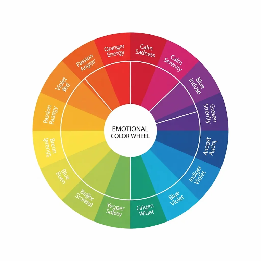
Red
- Emotional associations: Excitement, passion, urgency, energy
- Brand examples: Coca-Cola, Netflix, YouTube
- Use Case: Often used in sales, food, and entertainment industries to create excitement and prompt quick action.
- Usage tips: Use red to stimulate action, highlight calls-to-action, or create a sense of urgency.
Blue
- Emotional associations: Trust, calm, reliability, professionalism
- Brand examples: Facebook, IBM, Samsung
- Usage tips: Ideal for financial services, tech, and healthcare brands.
Green
- Emotional associations: Nature, health, growth, tranquility
- Brand examples: Starbucks, Whole Foods, Spotify
- Usage tips: Use for eco-friendly or wellness-oriented brands.
Yellow
- Emotional associations: Optimism, warmth, attention-grabbing
- Brand examples: McDonald’s, IKEA, Snapchat
- Usage tips: Great for creating a friendly, energetic brand personality.
Orange
- Emotional associations: Creativity, enthusiasm, friendliness
- Brand examples: Fanta, Harley-Davidson, Amazon
- Usage tips: Ideal for youthful, adventurous, or value-oriented brands.
Purple
- Emotional associations: Luxury, wisdom, creativity
- Brand examples: Cadbury, Hallmark, Twitch
- Usage tips: Use for premium, innovative, or imaginative products.
Black
- Emotional associations: Power, sophistication, authority
- Brand examples: Chanel, Nike, Gucci
- Usage tips: Effective for luxury branding, elegance, and minimalistic design.
White
- Emotional associations: Purity, simplicity, cleanliness
- Brand examples: Apple, Adidas, Tesla
- Usage tips: Use for minimalist designs, modernity, and clarity.
Other Colors
- Pink: Romance, femininity, softness (Victoria’s Secret)
- Brown: Stability, reliability, earthiness (UPS, M&M’s)
- Gray: Neutrality, professionalism, sophistication (LinkedIn, Apple)
Cultural and Contextual Differences

How Color Perception Changes Across Cultures
Colors do not carry universal meanings. For example:
- White symbolizes purity in Western cultures but mourning in some Asian countries.
- Red indicates luck and prosperity in China, but can symbolize danger or warning in other regions.
- Green represents environmental friendliness in the West but can have political or religious connotations elsewhere.
Contextual Meanings in Marketing
The context in which color is used can amplify or shift its perception:
- Luxury brands often combine black and gold to convey sophistication.
- Children’s products typically use bright, playful colors to stimulate joy and curiosity.
Global Brands Adjusting Colors
- McDonald’s modifies its palette for different countries, using more green in Europe to emphasize health-conscious branding.
- Pepsi maintains red, white, and blue globally but adjusts marketing campaigns to align with local cultural interpretations.
Color Combinations and Brand Identity
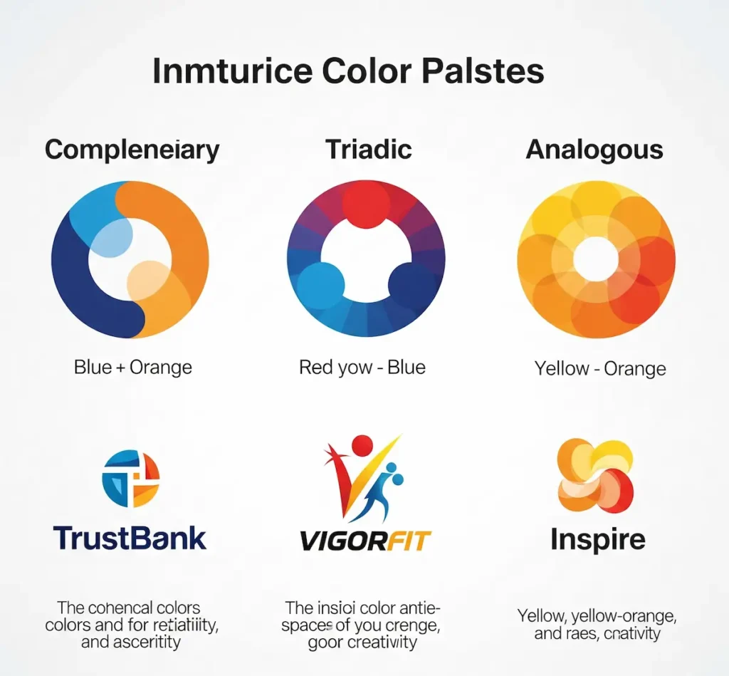
How Color Palettes Impact Brand Perception
A single color rarely defines a brand. Combinations create depth, harmony, and personality.
- Complementary colors (opposite on the color wheel) create visual contrast.
- Analogous colors (next to each other) create harmony and cohesion.
Tips for Choosing Colors
- Start with your core brand personality.
- Select a primary color aligned with your message.
- Choose accent colors for emphasis and balance.
- Test combinations for readability and accessibility.
Examples of Successful Brand Color Combinations
- Google: Blue, red, yellow, green → playful, inclusive, versatile
- FedEx: Purple and orange → reliability with energy
- Slack: Teal, purple, blue, green → creativity and collaboration
The Science Behind Color Psychology
Neurology and Human Perception of Color
Colors are perceived through light receptors in the eyes called cones. Signals are sent to the visual cortex and interpreted emotionally in the amygdala, linking color with feelings.
Emotional and Cognitive Responses
- Red can increase heart rate and create urgency.
- Blue has a calming effect and fosters trust.
- Yellow stimulates the brain, evoking cheerfulness and attention.
Supporting Research
- University of Loyola study: Color increases brand recognition by up to 80%.
- Impact on marketing psychology: Up to 90% of initial judgments about products are based on color alone.
- Neurological findings: Color can influence appetite, decision-making speed, and purchasing behavior.
Practical Tips for Brands
Choosing Brand Colors
- Align colors with your target audience and their expectations.
- Consider industry norms while finding ways to stand out.
Consistency Across Platforms
- Maintain the same colors in logos, websites, packaging, and advertising.
- Consistency reinforces brand identity and fosters trust.
Influence on Customer Behavior
- Strategic color choices can enhance loyalty, trust, and conversion rates.
- Example: Using blue on financial websites can increase perceived security.
Related Applications
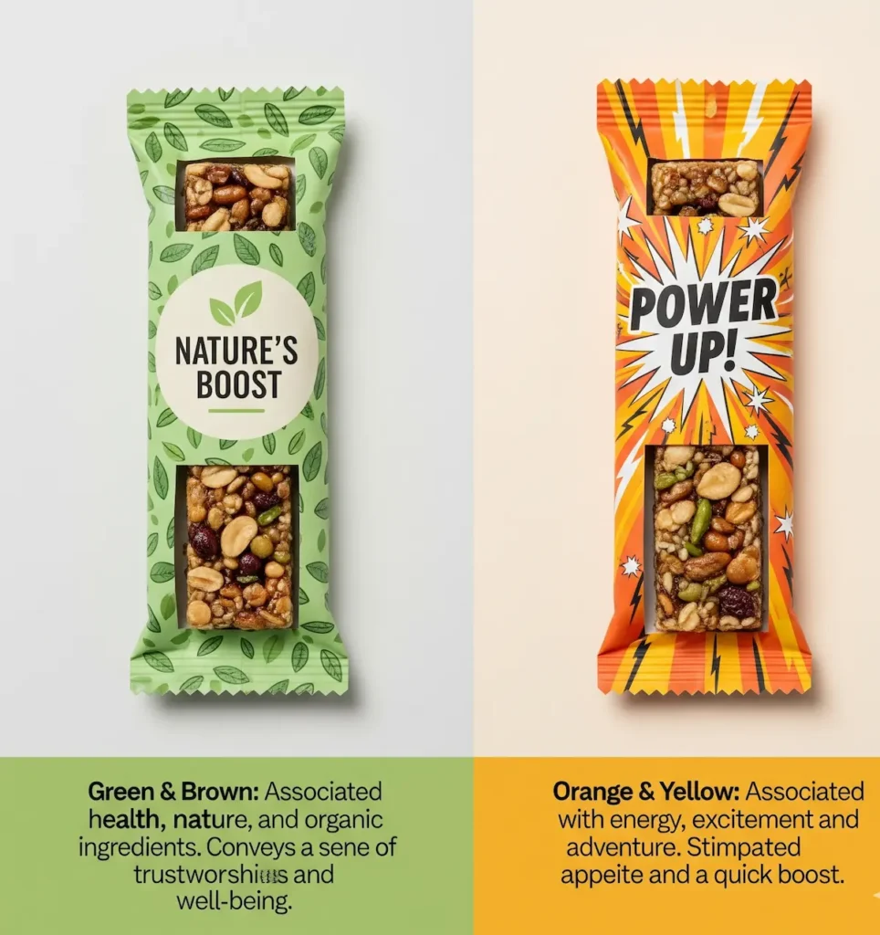
Packaging
- Color affects product perception and purchase decisions. Bright colors can attract impulse buyers, while muted tones suggest premium quality.
Advertising
- The emotional impact of color increases ad recall and engagement.
Digital Marketing & UX
- Buttons and CTAs in contrasting colors improve click-through rates.
- Website backgrounds and typography affect readability and emotional tone.
Trends in Color
- Seasonal trends, such as Pantone’s Color of the Year, influence marketing campaigns and packaging updates.
Conclusion
Color psychology is a powerful tool in shaping brand perception. From evoking emotions and creating first impressions to influencing customer behavior, the right color choices are essential for a strong brand identity.
Brands must consider:
- Emotional and cultural implications of colors
- Harmonious color combinations for cohesion
- Consistency across platforms and touchpoints
Careful application of color can elevate a brand, improve trust, and inspire loyalty. By understanding the science and psychology behind colors, businesses can make informed decisions that resonate deeply with their audience and create lasting impressions.
Final Thought: Choose your colors wisely, your brand is not just what you say; it’s what people feel when they see you.
FAQs: Color Psychology in Branding
1. What is color psychology in branding?
Color psychology in branding is the study of how colors influence customer emotions, perceptions, and behavior toward a brand. It helps businesses choose colors that align with their brand identity and appeal to their target audience.
2. How do colors affect brand perception?
Colors evoke emotions and associations that shape how people perceive a brand. For example, blue often conveys trust and professionalism, while red can signal excitement or urgency.
3. Which colors are best for branding?
The best colors depend on your brand’s values and target audience. For instance:
Blue: Trust and reliability
Red: Energy and passion
Green: Health and nature
Purple: Luxury and creativity
4. Can color choices influence consumer behavior?
Yes. Research shows that color can influence purchasing decisions, brand loyalty, and customer engagement. Proper use of color can drive conversions and increase recognition.
5. Do colors have the same meaning worldwide?
No. Color perception varies across cultures. For example, white represents purity in Western cultures but can symbolize mourning in some Eastern cultures. Global brands often adjust colors to suit local markets.
6. How can I choose the right colors for my brand?
Consider your target audience, brand values, and industry norms. Use complementary and harmonious color combinations and test how your audience reacts to different palettes.
7. Why is consistency in brand colors important?
Consistent use of brand colors across all platforms increases brand recognition, builds trust, and creates a cohesive brand identity.
8. How do color combinations impact branding?
The right combinations can create balance, highlight key elements, and convey brand personality. Complementary, analogous, and triadic color schemes are often used strategically.
9. Can trends in color affect my brand strategy?
Yes. Seasonal and trending colors can make your brand feel modern and relevant, but it’s important to balance trends with your core brand identity.
10. How does color influence digital marketing and UX?
Colors guide user attention, improve navigation, and enhance the overall experience on websites and apps. Strategic color use can increase engagement, clicks, and conversions.